

Game UI


Our Vanishing Summer
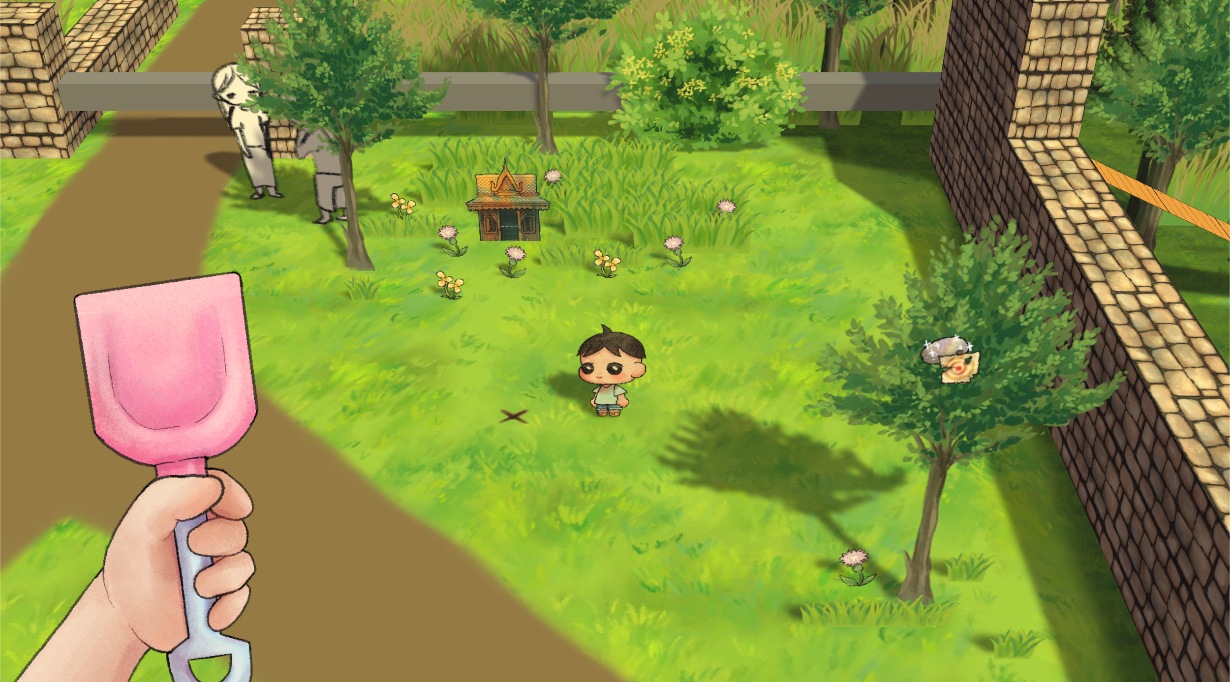
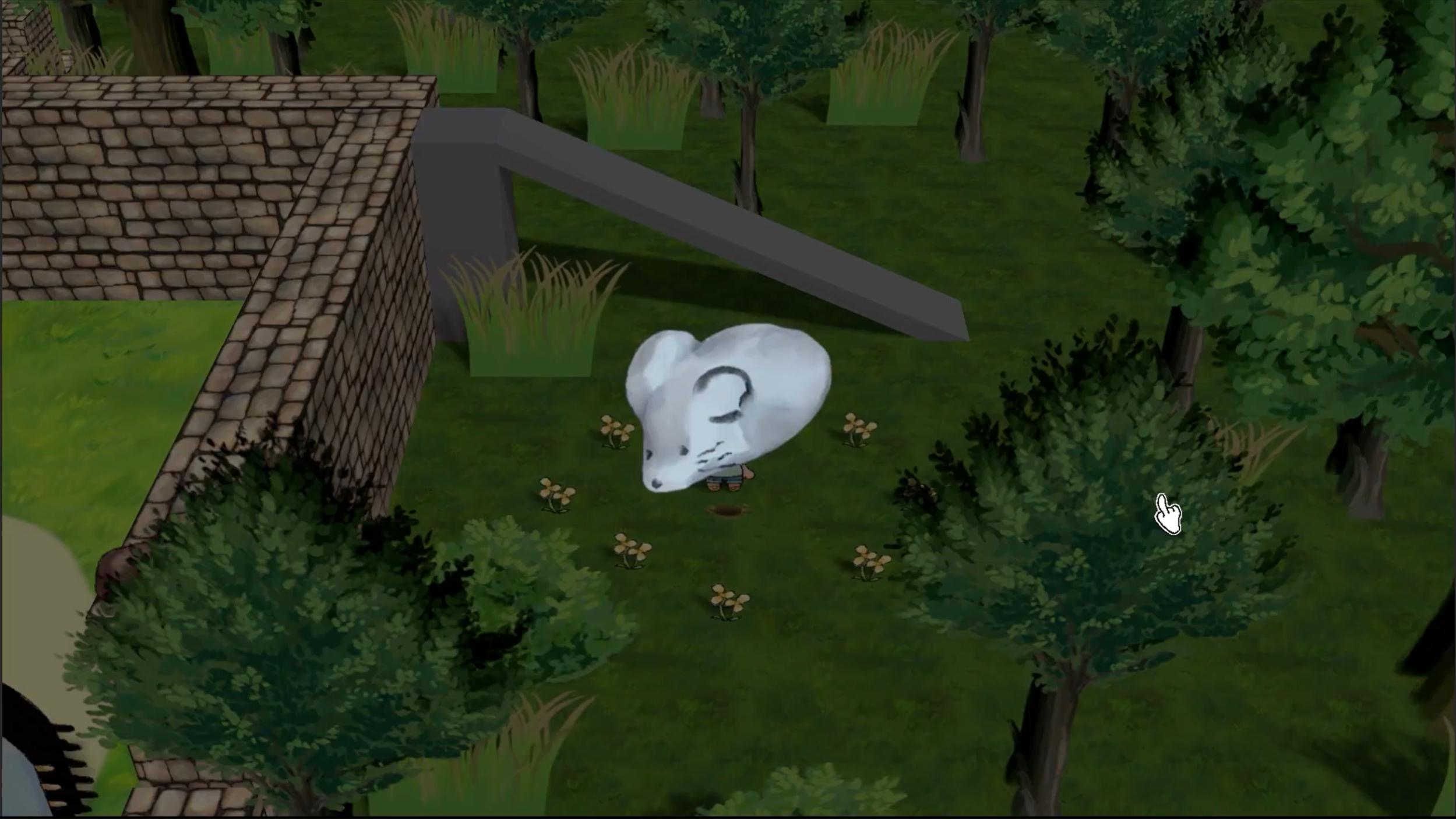
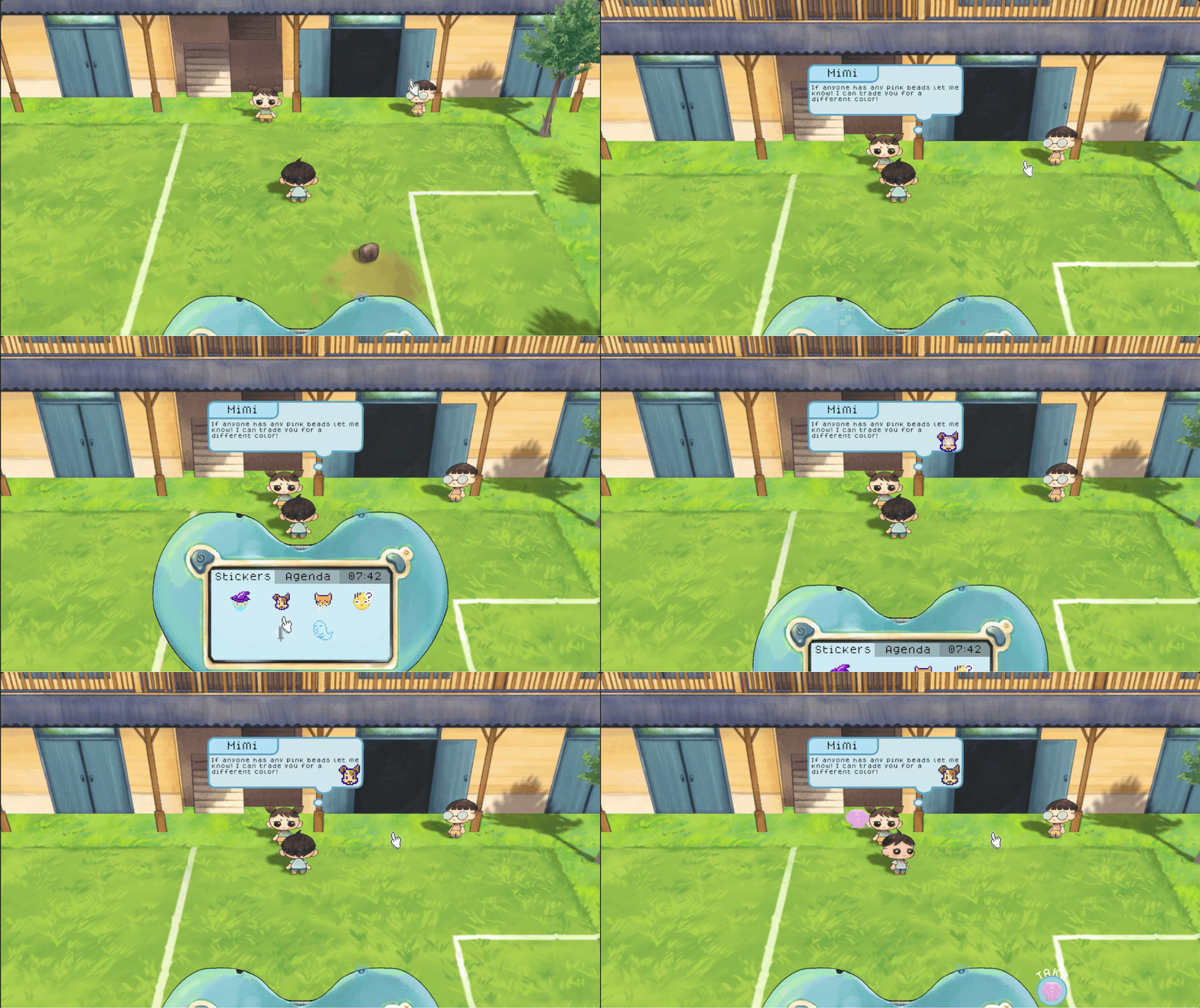
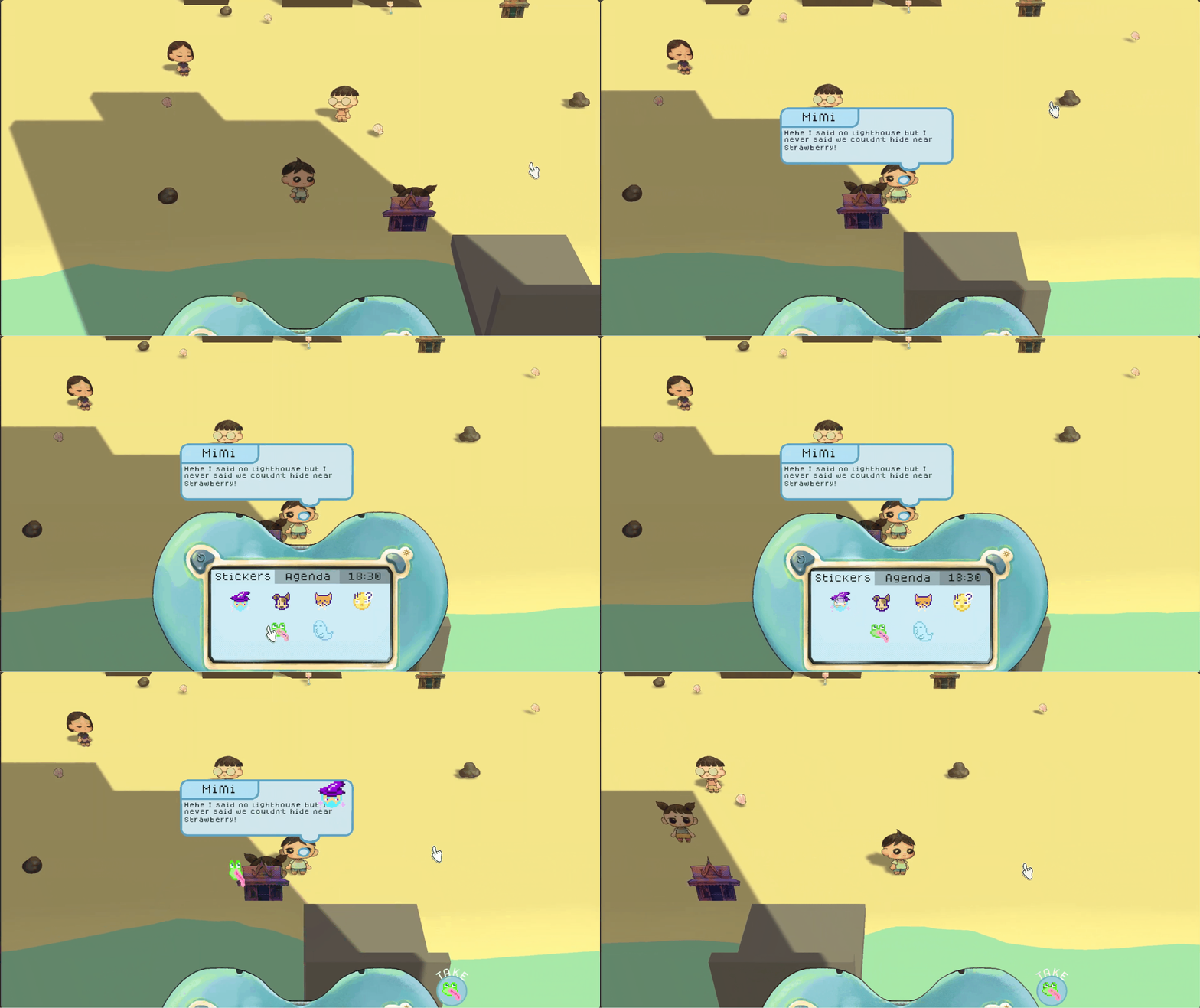
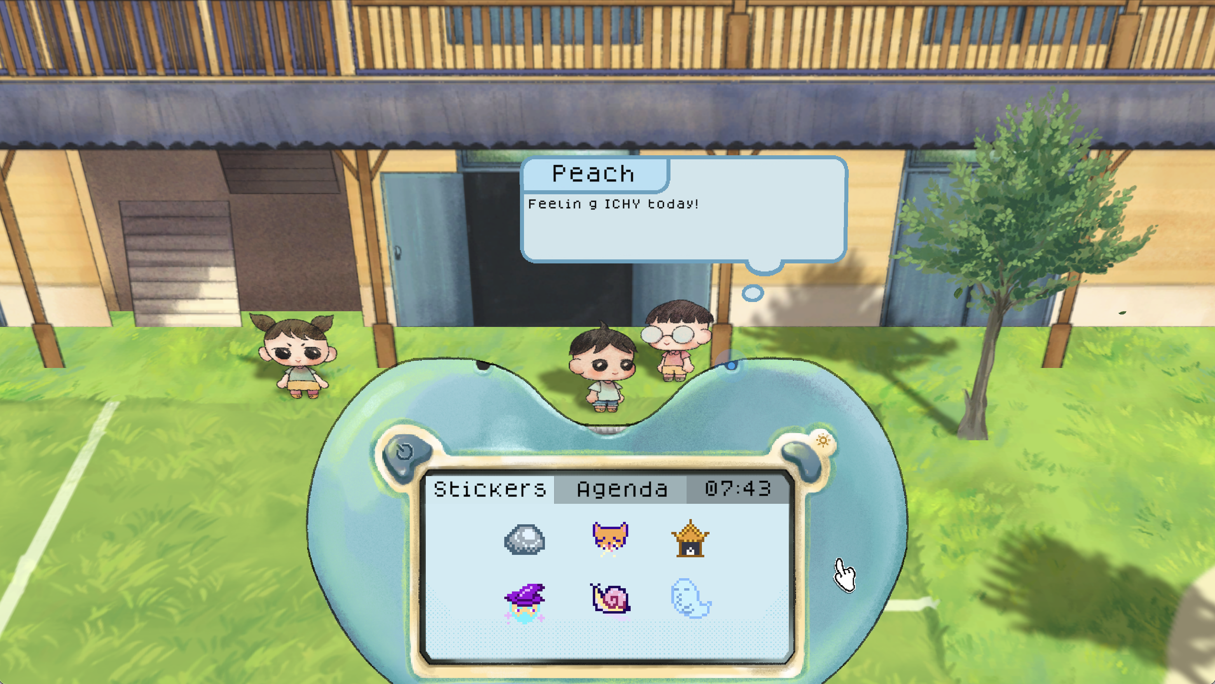
Our Vanishing Summer is a game in the mechanical convention of cozy games like Animal Crossing and Boku no Natsuyasumi, set to the backdrop of a tragic mystery in a small seaside town.
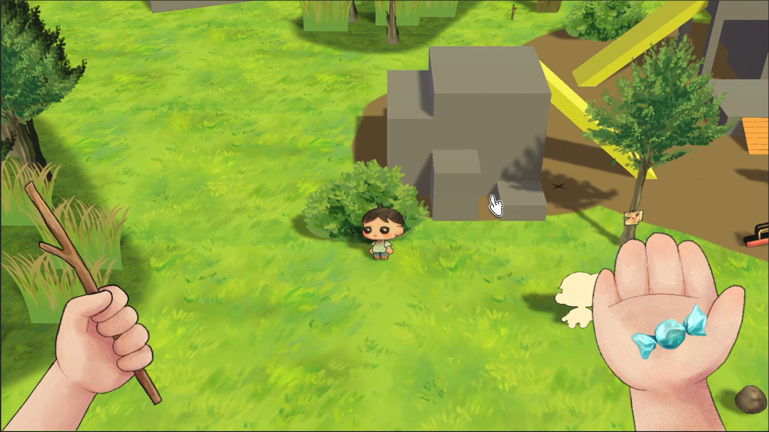
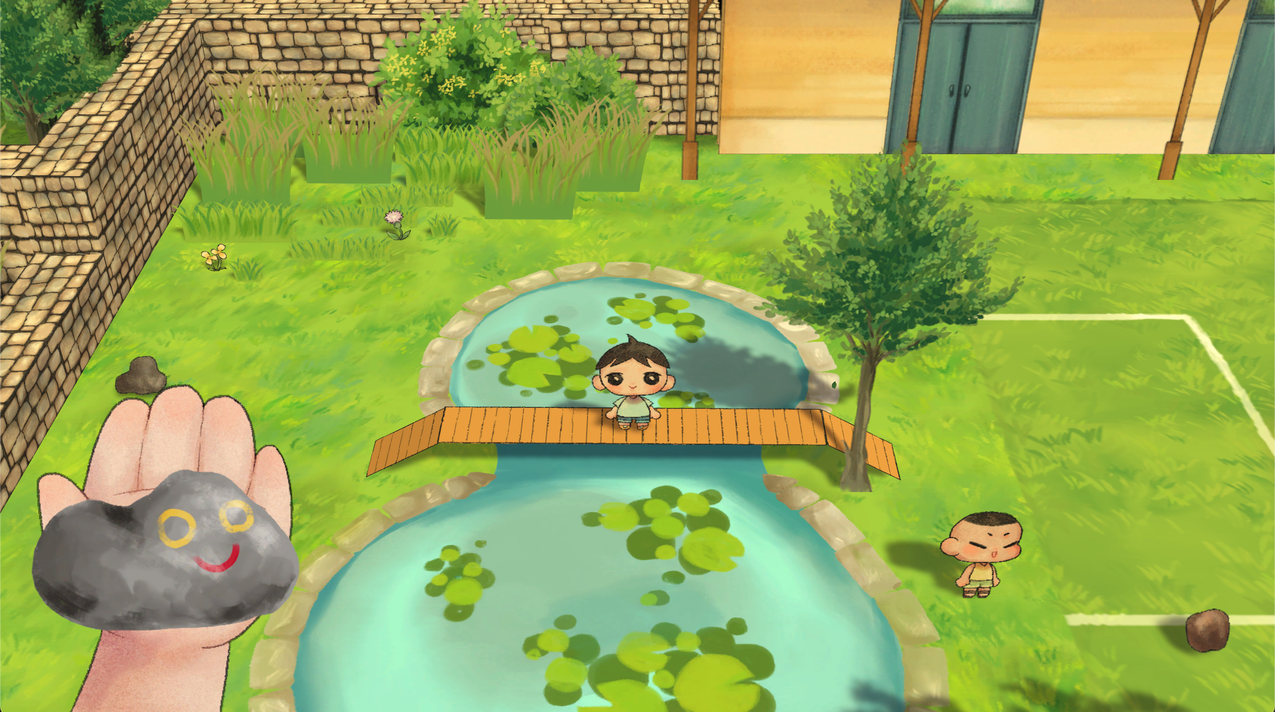
Design Goals — We wanted the player to feel embodied in their child character. Therefore I designed the 1st-person diegetic UI of the player’s 2 hands, to reflect the experience of collecting miscellaneous objects in childhood, and being limited to your own two hands.
We also wanted to emulate the experience of using an early 2000s technology made for kids with the device interface in the game. The device’s use should feel straightforward, as its main users would be children, and it should have very few specific uses, as inspired by devices and applications like DS PictoChat, a pager, or a Tamagotchi.
Home Sweet Home : Online


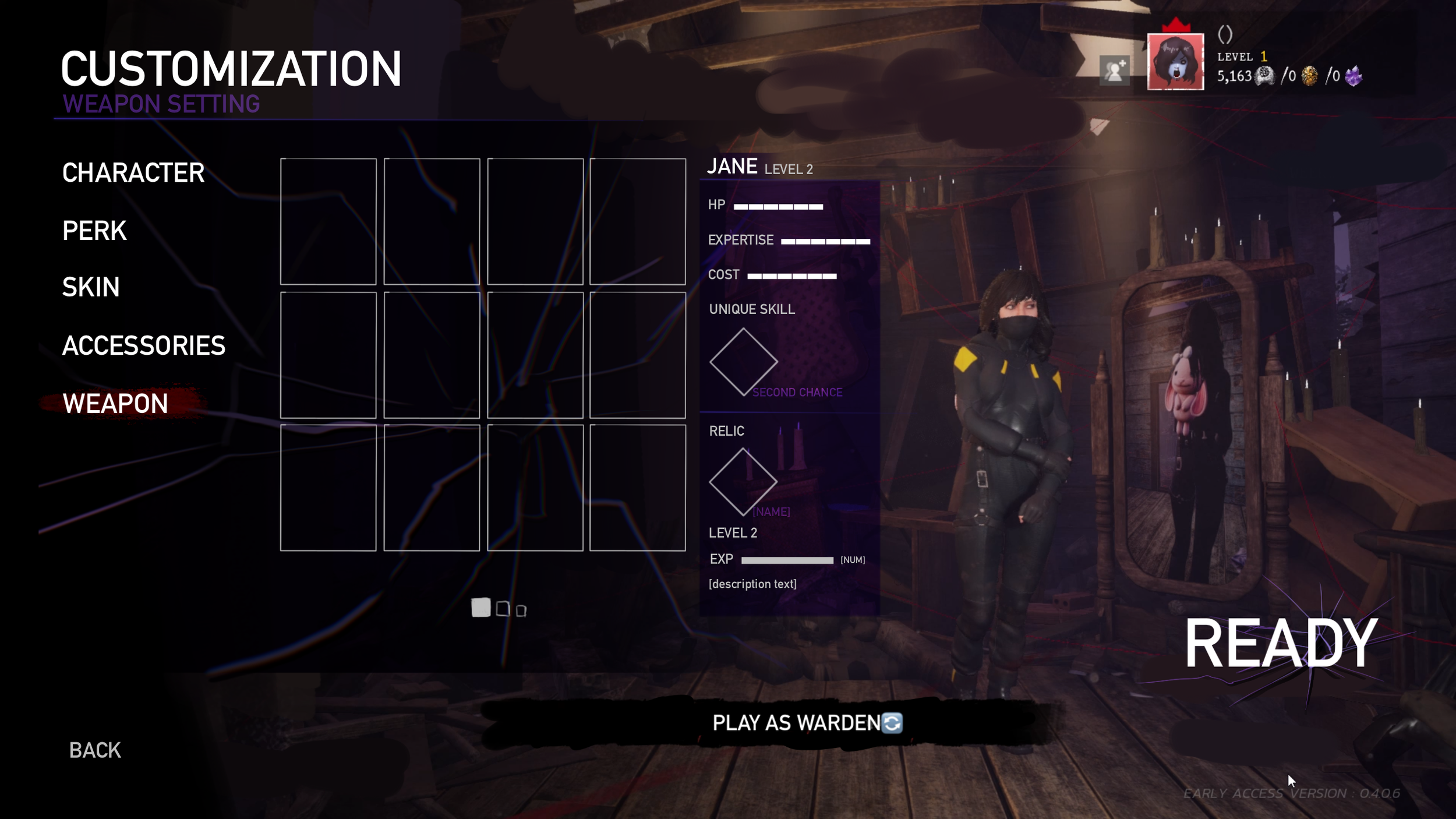


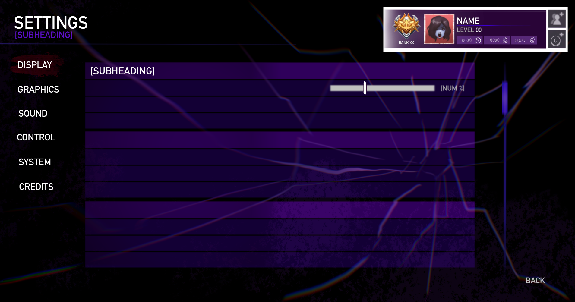
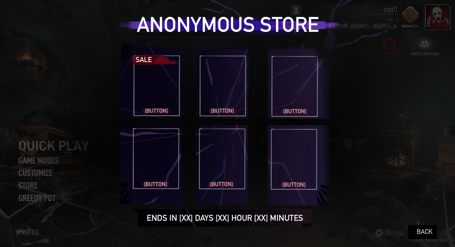

An online PVP horror game sets in the dimension between the living and the dead, inspired Thai myths and supersitions. The game includes a 4 vs 1 asymmetric multiplayer mode and 4 vs 4 battle mode.
Design Goals — The main challenge of designing the UI/UX for Home Sweet Home : Online was working with an already existing IP of Home Sweet Home, while also updating the art direction of the UI and the interaction design to be more modern and universal without losing its core identity of being inspired by Thai myths and culture.
The creative vision was an interface that signified a new era for the game series, that being the addition of an international cast of characters and a step into becoming an e-sport game. The result was a sleek, neon UI forgoed the original game’s antique Thai textures while still maintaining the shape language, like diamonds and cracks, that are inspired by the Thai-specific narrative present in the previous games.
Haven’s Toll: Doomslay


A 2.5D side-scrolling dress-up investigation game about a doomsday cult where players analyze styles of cult members to build relationships and get information.
Design Goals — We wanted to create an experience reminiscent of playing classic paper doll dress-up games from 2000s-2010s with less clutter and containing narrative, rather than a character customization page of a modern game,
As such, I came up with the diegetic closet and the mannequin UI where each clothing category are themselves buttons. This solution places the clothing option buttons into the game’s world and doesn’t require text to communicate the category as the shape of the item itself is apparent. Without text, it also frees up the space in the dress-up menu and answers our goal of not wanting the interface to look like a character customization page.
Untitled Fantasy Project - Inventory UI
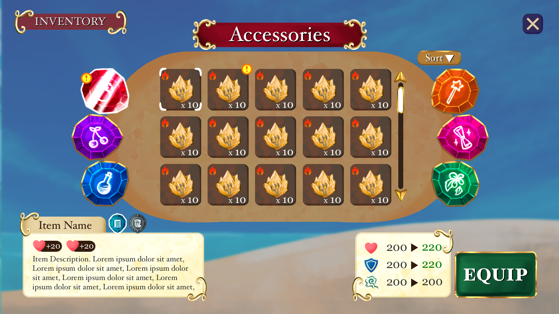
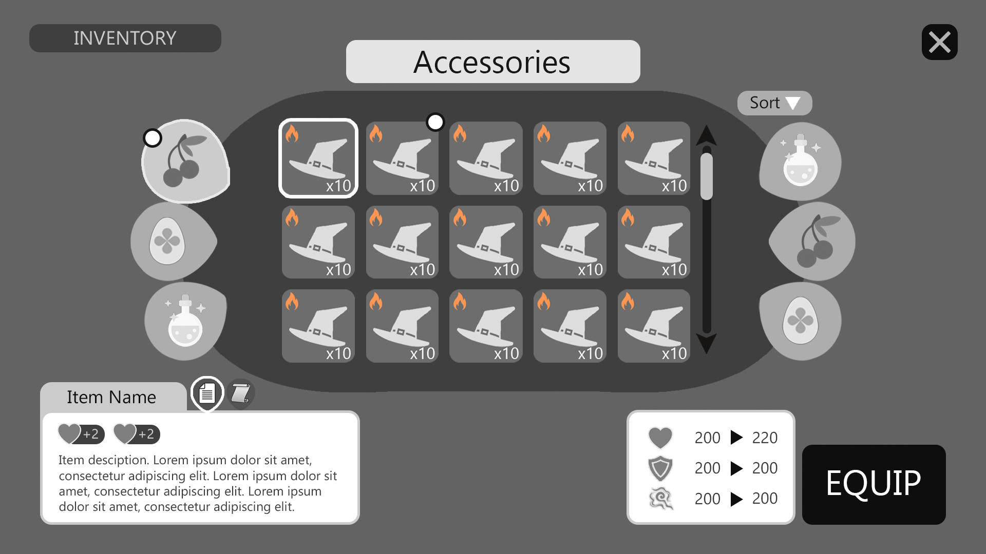
This was a speculative project where the game is a witch-themed action adventure RPG with anime aesthetics.
Design Goals — The first experiential goal of this UI was to be an easy and intuitive inventory that can be used very quickly with high scanability so as to not disrupt the flow of exploration. In addition, the other goal was to have the narrative of the game be learned through the inventory, allowing players to take their time if wanted to and find the lore and stories of those items.
As such, the UI featured a large sortable grid inventory that can be understood at a quick glance, with key information presented as icons to aid the scanability, and the UI elements being heavily themed to visually tie into the narrative. The item descriptions were also separated from the lore tab, so that the page doesn’t become overflowed with many paragraphs of text, and answered to the goal of players being able to take their time to learn the story if desired.